I often get told that we accountants must dream in “black and white” because most reports are, well, “black and white”.
For me, I love color, and it is amazing how even the two colors “green” and “red” can really make a set of reports come alive and make more sense.
In fact, the program Color Accounting, a breakthrough in learning accounting uses colors (green, yellow, purple) as a tool to teach people how to deeply understand the dynamics of accounting. It is an amazing program taught in one day and is really a breakthrough in learning. Without color it would be boring and would, frankly, just not work.
Cash-Flow in Color
Take a look at this cash-flow statement in black and white, and tell me whether it is easy to understand:
Boring, right?
Now look at this one, the one we present monthly to our clients:
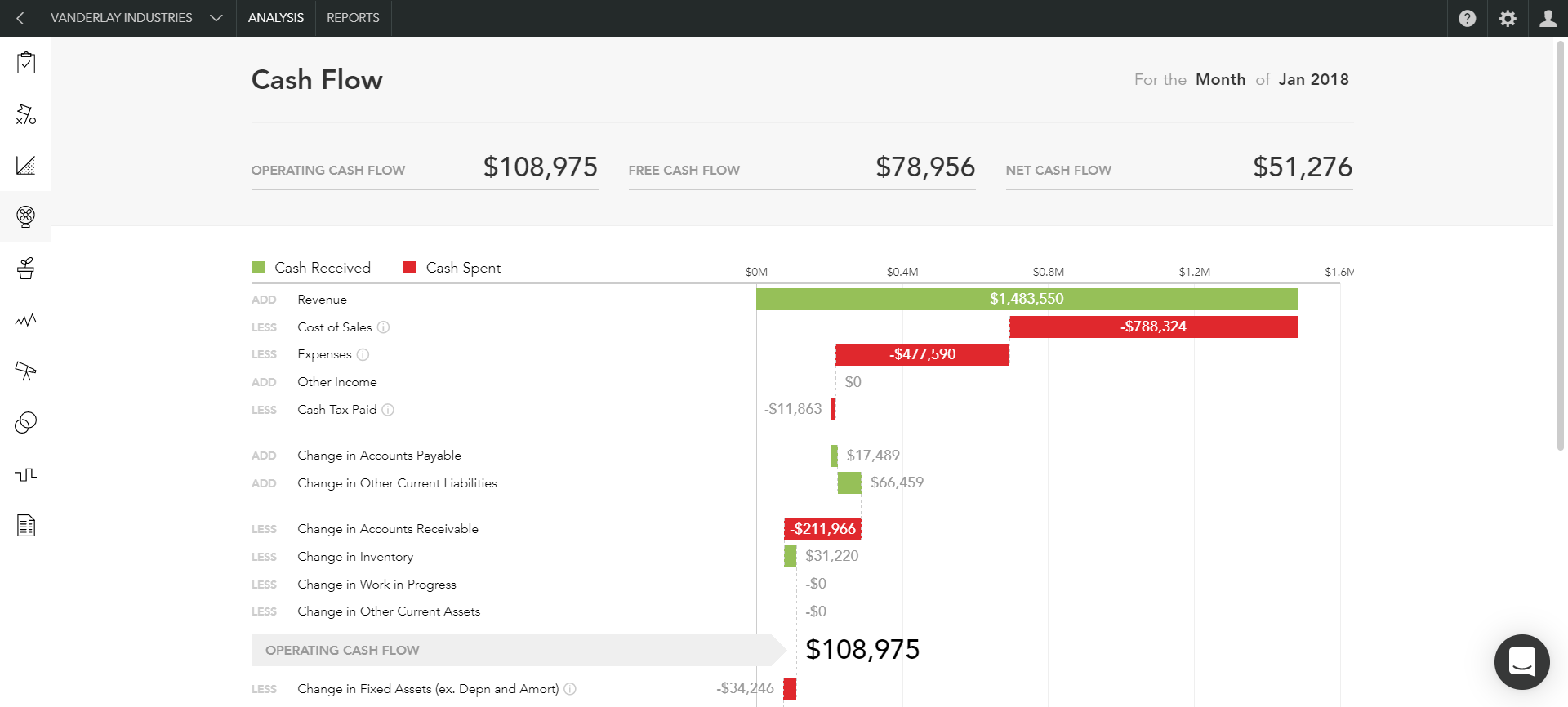
This shows money coming in and going out as if it is flowing down a waterfall, with money coming in colored in green and money going out colored in red.
All of our clients now understand their cash-flow, as it has come alive, visually.
Key Performance Indicators
Most businesses must track a few Key Performance Indicators, and again, showing in black and white can be quite bland, non-attention grabbing and not emphasizing critical decisions that need to be made by using “red” and “green” to highlight key numbers.
Let me show you an example of how presentation can drive you to know your business better, ask better questions, and then, as a result, make informed, trackable business decisions
Take a look at these two common reports – an Income Statement and a Balance Sheet:
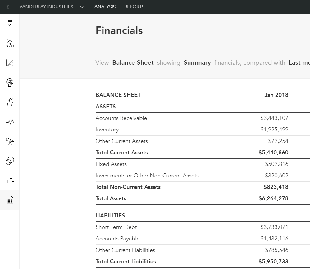
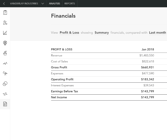
All of the information contained therein is rather meaningless without two things:
- Something to compare it to
- Ratios and indicators derived from the above numbers
Finally, by adding color, they sparkle and pop, coming alive!
First, let’s see the impact of adding comparative numbers to the two standard reports above:
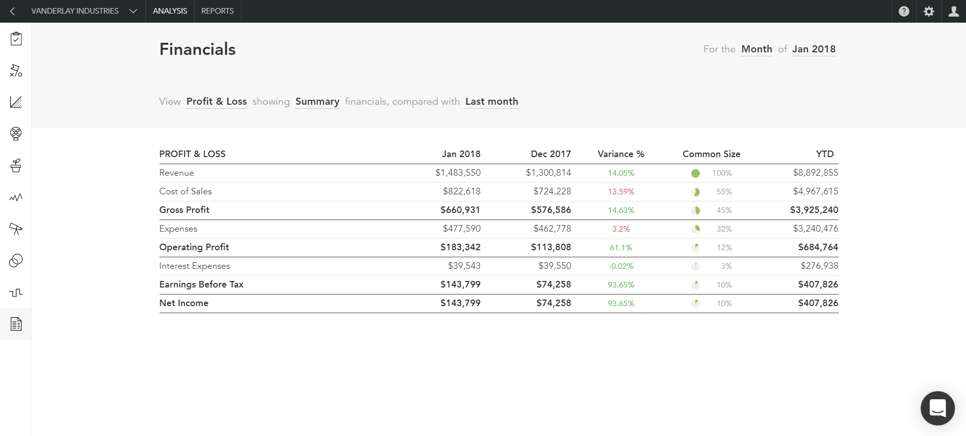
The above Income Statement now has a comparative column showing the month before and a variance column showing the changes. When it is a positive variance it is green, when negative, red. There is also a column showing the year-to-date figures.
We could compare the numbers to a Target or Budget.
You see, without a comparison, the first column has no meaning (or very limited meaning).
Now, take a look at this Chart:
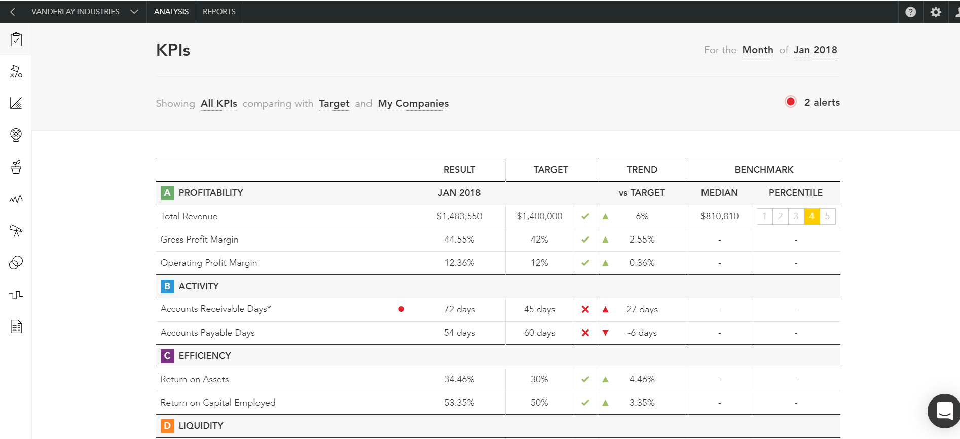
All of the numbers above are derived from the two reports above. However, what a simple dashboard like this gives you is the following:
- A goal to aim for – the Target and whether you hit it, or not
- When you hit it, you get a green checkmark
- When you don’t, you get a red cross
- These numbers can be compared to Benchmarks as well
This simple dashboard can give you, the business owner a condensed, summarized view of your business.
Here is an example of how that report can drive business decisions. Firstly, let’s look at the first red X – Accounts Receivable Days.
The target is 45 days. The actual is 72 days. What does this mean, you may ask? It means that on average it is taking you 72 days to collect your accounts receivable. This is a long time to wait to be paid, and it is definitely longer than your pre-set Target.
This observation can lead to more questions:
- Have we softened our credit terms, allowing people to take longer to pay us?
- Have we taken on poor paying customers, just to get a sale, and now they cannot pay us?
- Do we even have a credit policy, and should we change it?
Now, you can really dig in and get some answers which will lead you, as business owner, to take action in the critically important area of your business – cash-flow!
Trends
Looking at what is happening as a Trend, again in color, and in an attractive visual way can really help spot things you might not see looking a black and white row of numbers.
Option 1 is to present your numbers in a simple table, like this:
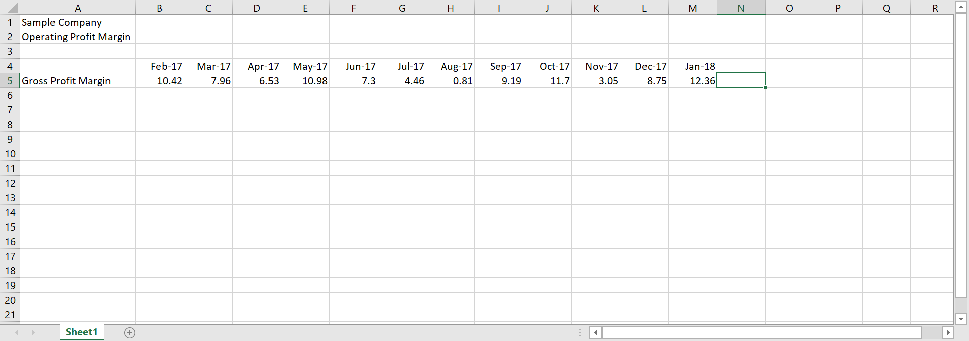
Although the image below is a bit smallish to scale for this Blog, look at the difference, with the exact same numbers as presented below.
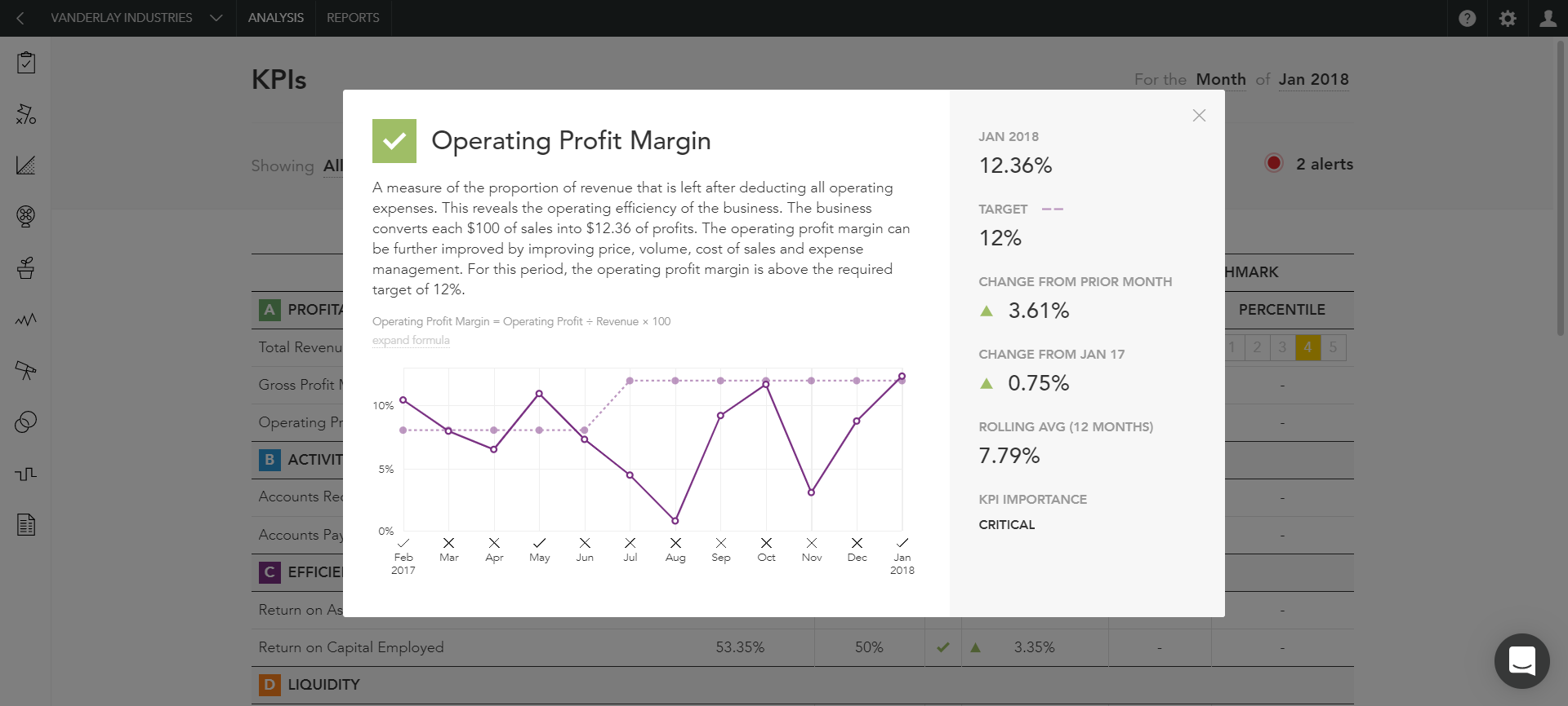
What pops out first is that big drop in August, which just doesn’t stand out in the first Chart above. This can lead to more questions and further investigation.
As you will note, on the side bar, in addition are included the operating margin for the current month, compared to the Target, the positive change from the month before, and from the same month in the prior year, and, finally, the rolling 12-month average.
Conclusion
How your numbers are presented to you has the following critically important benefits:
- Your understanding of your business deepens
- The numbers will often lead to asking better and more relevant questions
- The decisions you make will have more meaning when tracked by the numbers.
Here is an example. We recently implemented a powerful software that helps improve the speed of collections on our clients accounts receivable. Because we track Accounts Receivable Days for all our clients, we can spot numbers off-Target and provide solutions.
We could see quite quickly that this powerful software had an impact on the Accounts Receivable Days. It went down, which is favorable.
Finally, even more important than nice visuals are having reports that are impeccable, with reliable, solid numbers. That is what we provide, and without that, nothing else will work.
Thanks for reading…